Posts

Showing posts with the label Website

How to Create your own Website or Blog for Free

Image
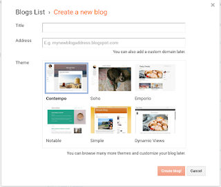
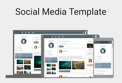
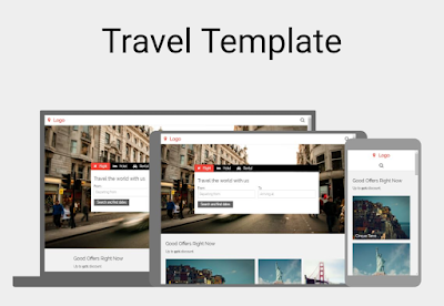
Free Websites and Blogs Does this sound too good to be true? I promise you it's not and I will show you exactly how to do this yourself. Step 1 Join Blogger Blogger is a part of Google it provides an easy to use platform for creating, adding to, and editing Blogs and Websites. Free hosting, and even your own domain using .blogspot.com It's 100% free to join and use. With tons of Free Resources Blogger provides to add widgets and exciting content to your sites. Step 2 Create Tap a few buttons to agree to terms then choose a name for your new Blog or Website below that create the web address if what you want isn't available just try variations until you find something that fits. You will also get the option to purchase a custom domain if you want. Next pick a template. No worries this will be easy to change at anytime so just select one you like and Create. Step 3 Add Content Your new Website or Blog is already live on the internet it w...

Social Media Template

Image
Free Social Media Template by w3 "W3.CSS Website Templates We have created some responsive W3.CSS website templates for you to use. You are free to modify, save, share, and use them in all your projects." Source Code <!DOCTYPE html> <html> <title>W3.CSS Template</title> <meta charset="UTF-8"> <meta name="viewport" content="width=device-width, initial-scale=1"> <link rel="stylesheet" href="https://www.w3schools.com/w3css/4/w3.css"> <link rel="stylesheet" href="https://www.w3schools.com/lib/w3-theme-blue-grey.css"> <link rel='stylesheet' href='https://fonts.googleapis.com/css?family=Open+Sans'> <link rel="stylesheet" href="https://cdnjs.cloudflare.com/ajax/libs/font-awesome/4.7.0/css/font-awesome.min.css"> <style> html,body,h1,h2,h3,h4,h5 {font-family: ...

Free CSS Responsive Grid Template 1

Image
CSS Grid Template 1 Source Code <!doctype html> <title>CSS Grid Template 1</title> <style> body {   display: grid;   grid-template-areas:     "header header header"     "nav article ads"     "nav footer footer";   grid-template-rows: 80px 1fr 70px;   grid-template-columns: 20% 1fr 15%;   grid-row-gap: 10px;   grid-column-gap: 10px;   height: 100vh;   margin: 0;   } header, footer, article, nav, div {   padding: 1.2em;   background: gold;   } #pageHeader {   grid-area: header;   } #pageFooter {   grid-area: footer;   } #mainArticle {   grid-area: article;      } #mainNav {   grid-area: nav;   } #siteAds {   grid-area: ads;   } /* Stack the layout on small devices/viewports. */ @media all and (max-width: 575px) {   body {     grid-template...

Free Analytics Website Template

Image
Free Analytics Template by w3 "W3.CSS Website Templates We have created some responsive W3.CSS website templates for you to use. You are free to modify, save, share, and use them in all your projects." Source Code <!DOCTYPE html> <html> <title>W3.CSS Template</title> <meta charset="UTF-8"> <meta name="viewport" content="width=device-width, initial-scale=1"> <link rel="stylesheet" href="https://www.w3schools.com/w3css/4/w3.css"> <link rel="stylesheet" href="https://fonts.googleapis.com/css?family=Raleway"> <link rel="stylesheet" href="https://cdnjs.cloudflare.com/ajax/libs/font-awesome/4.7.0/css/font-awesome.min.css"> <style> html,body,h1,h2,h3,h4,h5 {font-family: "Raleway", sans-serif} </style> <body class="w3-light-grey"> ...

Photography Portfolio Website Template

Image
Free Photo Portfolio Website Template from w3 "W3.CSS Website Templates We have created some responsive W3.CSS website templates for you to use. You are free to modify, save, share, and use them in all your projects." Source Code <!DOCTYPE html> <html lang="en"> <title>W3.CSS Template</title> <meta charset="UTF-8"> <meta name="viewport" content="width=device-width, initial-scale=1"> <link rel="stylesheet" href="https://www.w3schools.com/w3css/4/w3.css"> <body> <!-- Header --> <header class="w3-display-container w3-content w3-center" style="max-width:1500px">   <img class="w3-image" src="/w3images/photographer.jpg" alt="Me" width="1500" height="600">   <div class="w3-display-middle w3-padding-large w3-border w3-wide ...

Free Travel Website Template

Image
Free Travel Template by w3 "W3.CSS Website Templates We have created some responsive W3.CSS website templates for you to use. You are free to modify, save, share, and use them in all your projects." Source Code <!DOCTYPE html> <html> <title>W3.CSS Template</title> <meta charset="UTF-8"> <meta name="viewport" content="width=device-width, initial-scale=1"> <link rel="stylesheet" href="https://www.w3schools.com/w3css/4/w3.css"> <link rel="stylesheet" href="https://fonts.googleapis.com/css?family=Raleway"> <link rel="stylesheet" href="https://cdnjs.cloudflare.com/ajax/libs/font-awesome/4.7.0/css/font-awesome.min.css"> <style> body,h1,h2,h3,h4,h5,h6 {font-family: "Raleway", Arial, Helvetica, sans-serif} .myLink {display: none} </style> ...

Free CSS Responsive Grid Template 2

Image
CSS Responsive Grid Template 2 Source Code <!doctype html> <title>CSS Grid Template 2</title> <style> body {    display: grid;   grid-template-areas:      "header header header"     "nav article ads"     "footer footer footer";   grid-template-rows: 80px 1fr 70px;     grid-template-columns: 20% 1fr 15%;   grid-row-gap: 10px;   grid-column-gap: 10px;   height: 100vh;   margin: 0;   }   header, footer, article, nav, div {   padding: 1.2em;   background: gold;   } #pageHeader {   grid-area: header;   } #pageFooter {   grid-area: footer;   } #mainArticle {    grid-area: article;         } #mainNav {    grid-area: nav;    } #siteAds {    grid-area: ads;    }  ...

Free App Launch Website Template

Image
App Launch Website Template from w3 "W3.CSS Website Templates We have created some responsive W3.CSS website templates for you to use. You are free to modify, save, share, and use them in all your projects." Source Code <!DOCTYPE html> <html> <title>W3.CSS Template</title> <meta charset="UTF-8"> <meta name="viewport" content="width=device-width, initial-scale=1"> <link rel="stylesheet" href="https://www.w3schools.com/w3css/4/w3.css"> <link rel="stylesheet" href="https://fonts.googleapis.com/css?family=Poppins"> <link rel="stylesheet" href="https://cdnjs.cloudflare.com/ajax/libs/font-awesome/4.7.0/css/font-awesome.min.css"> <style> body,h1,h2,h3,h4,h5 {font-family: "Poppins", sans-serif} body {font-size: 16px;} img {margin-bottom: -8px;} .mySlides {display:...