Posts

Showing posts with the label template

Social Media Template
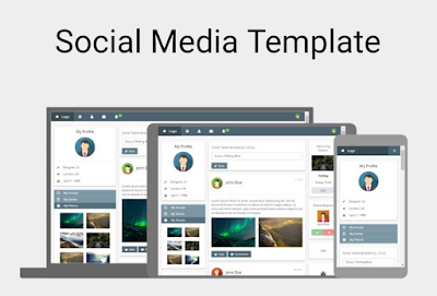
Image
Free Social Media Template by w3 "W3.CSS Website Templates We have created some responsive W3.CSS website templates for you to use. You are free to modify, save, share, and use them in all your projects." Source Code <!DOCTYPE html> <html> <title>W3.CSS Template</title> <meta charset="UTF-8"> <meta name="viewport" content="width=device-width, initial-scale=1"> <link rel="stylesheet" href="https://www.w3schools.com/w3css/4/w3.css"> <link rel="stylesheet" href="https://www.w3schools.com/lib/w3-theme-blue-grey.css"> <link rel='stylesheet' href='https://fonts.googleapis.com/css?family=Open+Sans'> <link rel="stylesheet" href="https://cdnjs.cloudflare.com/ajax/libs/font-awesome/4.7.0/css/font-awesome.min.css"> <style> html,body,h1,h2,h3,h4,h5 {font-family: ...

Free CSS Responsive Grid Template 1

Image
CSS Grid Template 1 Source Code <!doctype html> <title>CSS Grid Template 1</title> <style> body {   display: grid;   grid-template-areas:     "header header header"     "nav article ads"     "nav footer footer";   grid-template-rows: 80px 1fr 70px;   grid-template-columns: 20% 1fr 15%;   grid-row-gap: 10px;   grid-column-gap: 10px;   height: 100vh;   margin: 0;   } header, footer, article, nav, div {   padding: 1.2em;   background: gold;   } #pageHeader {   grid-area: header;   } #pageFooter {   grid-area: footer;   } #mainArticle {   grid-area: article;      } #mainNav {   grid-area: nav;   } #siteAds {   grid-area: ads;   } /* Stack the layout on small devices/viewports. */ @media all and (max-width: 575px) {   body {     grid-template...

Free Analytics Website Template

Image
Free Analytics Template by w3 "W3.CSS Website Templates We have created some responsive W3.CSS website templates for you to use. You are free to modify, save, share, and use them in all your projects." Source Code <!DOCTYPE html> <html> <title>W3.CSS Template</title> <meta charset="UTF-8"> <meta name="viewport" content="width=device-width, initial-scale=1"> <link rel="stylesheet" href="https://www.w3schools.com/w3css/4/w3.css"> <link rel="stylesheet" href="https://fonts.googleapis.com/css?family=Raleway"> <link rel="stylesheet" href="https://cdnjs.cloudflare.com/ajax/libs/font-awesome/4.7.0/css/font-awesome.min.css"> <style> html,body,h1,h2,h3,h4,h5 {font-family: "Raleway", sans-serif} </style> <body class="w3-light-grey"> ...

Photography Portfolio Website Template

Image
Free Photo Portfolio Website Template from w3 "W3.CSS Website Templates We have created some responsive W3.CSS website templates for you to use. You are free to modify, save, share, and use them in all your projects." Source Code <!DOCTYPE html> <html lang="en"> <title>W3.CSS Template</title> <meta charset="UTF-8"> <meta name="viewport" content="width=device-width, initial-scale=1"> <link rel="stylesheet" href="https://www.w3schools.com/w3css/4/w3.css"> <body> <!-- Header --> <header class="w3-display-container w3-content w3-center" style="max-width:1500px">   <img class="w3-image" src="/w3images/photographer.jpg" alt="Me" width="1500" height="600">   <div class="w3-display-middle w3-padding-large w3-border w3-wide ...

Free Travel Website Template

Image
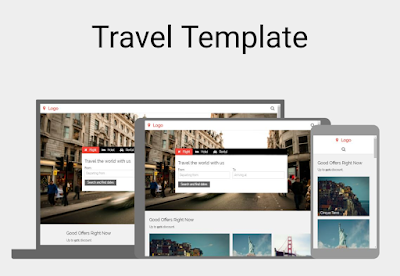
Free Travel Template by w3 "W3.CSS Website Templates We have created some responsive W3.CSS website templates for you to use. You are free to modify, save, share, and use them in all your projects." Source Code <!DOCTYPE html> <html> <title>W3.CSS Template</title> <meta charset="UTF-8"> <meta name="viewport" content="width=device-width, initial-scale=1"> <link rel="stylesheet" href="https://www.w3schools.com/w3css/4/w3.css"> <link rel="stylesheet" href="https://fonts.googleapis.com/css?family=Raleway"> <link rel="stylesheet" href="https://cdnjs.cloudflare.com/ajax/libs/font-awesome/4.7.0/css/font-awesome.min.css"> <style> body,h1,h2,h3,h4,h5,h6 {font-family: "Raleway", Arial, Helvetica, sans-serif} .myLink {display: none} </style> ...

Free CSS Responsive Grid Template 2

Image
CSS Responsive Grid Template 2 Source Code <!doctype html> <title>CSS Grid Template 2</title> <style> body {    display: grid;   grid-template-areas:      "header header header"     "nav article ads"     "footer footer footer";   grid-template-rows: 80px 1fr 70px;     grid-template-columns: 20% 1fr 15%;   grid-row-gap: 10px;   grid-column-gap: 10px;   height: 100vh;   margin: 0;   }   header, footer, article, nav, div {   padding: 1.2em;   background: gold;   } #pageHeader {   grid-area: header;   } #pageFooter {   grid-area: footer;   } #mainArticle {    grid-area: article;         } #mainNav {    grid-area: nav;    } #siteAds {    grid-area: ads;    }  ...

Free App Launch Website Template

Image
App Launch Website Template from w3 "W3.CSS Website Templates We have created some responsive W3.CSS website templates for you to use. You are free to modify, save, share, and use them in all your projects." Source Code <!DOCTYPE html> <html> <title>W3.CSS Template</title> <meta charset="UTF-8"> <meta name="viewport" content="width=device-width, initial-scale=1"> <link rel="stylesheet" href="https://www.w3schools.com/w3css/4/w3.css"> <link rel="stylesheet" href="https://fonts.googleapis.com/css?family=Poppins"> <link rel="stylesheet" href="https://cdnjs.cloudflare.com/ajax/libs/font-awesome/4.7.0/css/font-awesome.min.css"> <style> body,h1,h2,h3,h4,h5 {font-family: "Poppins", sans-serif} body {font-size: 16px;} img {margin-bottom: -8px;} .mySlides {display:...